Mapping Press Releases in the 2015 Canadian Federal Election

I originally published this post on the mldb.ai blog that is now unavailable
On October 19th, Canadians will vote in the 42nd federal election. By Canadian standards, having lasted 78 days, this has been a very long election campaign, giving the parties many opportunities and reasons to put out press releases. The MLDB team at Datacratic decided to treat these press releases as a data set to be explored using Datacratic’s Machine Learning Database (MLDB), and here is what we came up with.
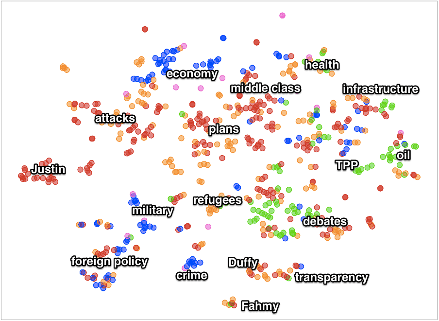
The image below is a map with 620 dots each representing one English-language press release from the four non-regional Canadian federal political parties: the governing Conservatives in blue, the opposition New Democrats in orange, the challenger Liberals in red and the underdog Greens in green. The closer two dots are, the more similar the text of the press releases they represent.
The white text labels were placed by hand to give a sense of what the various groupings mean, but at the bottom of this page there is an interactive version where you can mouse over each dot to see the title of the corresponding press release, so you can explore this map yourself. We also plotted the position of a few individual words in pink, which you can mouse over in the interactive version below. The regional Bloc Québécois party does not appear as it does not put out English-language press releases.
What conclusions can we draw from this map?
Some observations:
- The Conservatives focused their press releases on specific topics like the economy, the military, terrorism and crime
- The Liberals and NDP put out a large number of press releases criticizing each other and the current Prime Minister Stephen Harper
- The Liberals put out press releases on many topics, but were the only ones to put out quite so many focused on their leader Justin Trudeau (the red group on the left)
- The Greens focused on the environment, the oil sands and the Trans-Pacific Parternship treaty
- Some hot-button issues appear as a cluster like the Mike Duffy scandal and the refugee crisis, but there doesn’t appear to be a cluster around the very touchy niqab issue (only two releases contained that word, one Liberal and one NDP)
- Small clusters appear here and there when a number of very similar press releases came out, such as the orange group in the upper left with a theme of “Justin Trudeau has #noplan” or the orange cluster in the middle with a theme of “NDP Fact Check”
How was this map made?
Full technical details can be found in this Jupyter Notebook and the dataset is available in the companion Github repository but at a high level, we loaded a CSV file with the 620 press releases into MLDB, and then used the word2vec vector space embedding tool to compute a location for each word in each press release in a high-dimensional space. We used these to compute locations for each press release within that space by finding the centroids of the word locations. We then used the t-SNE algorithm to reduce the dimensionality of the space to 2 so as to make a scatterplot.
What are other applications of this technology?
A similar workflow can be used to analyse any group of documents to find patterns, be they tweets or books or textual descriptions of products for sale. This approach can be generalized to non-textual data as well, such as social network analysis, customer purchasing patterns, or even image similarity. If you would like to apply this kind of mapping approach to your data, please contact us and we would be excited to show you how MLDB can help you!
